1. Headline Inflation Itself

2. Stock-Bond Correlation

3. Inflation Momentum

4. Inflation Pipeline

5. Economic Slack

6. Labour Tightness

7. Wage Inflation

8. Inflation Expectations

9. Real Asset Price Action

10. The Fiscal/Monetary Fusion

Source: Man Solutions; as of 30 June 2021.
1. HEADLINE INFLATION ITSELF

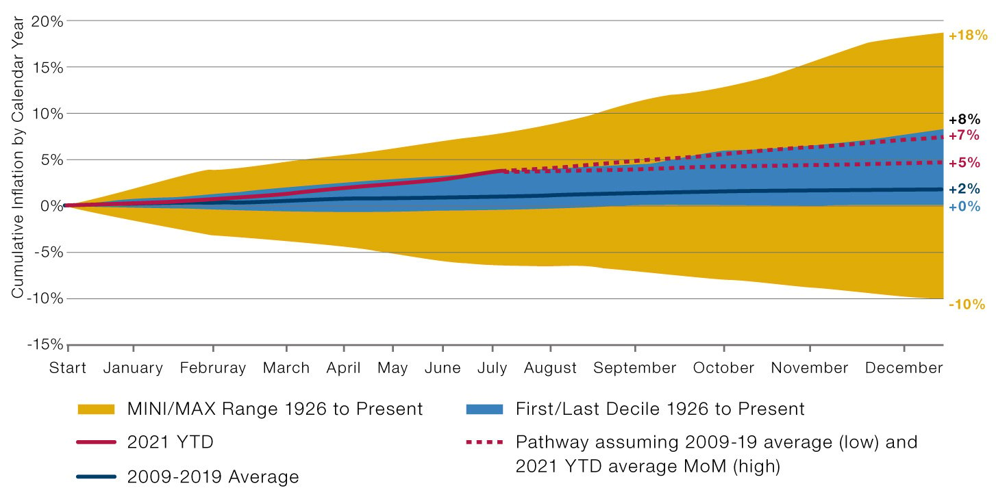
We’re simple folk and like an obvious starting point. And none is more obvious than the official numbers produced by the Bureau of Labour Statistics. A couple of caveats. First, we prefer headline to core. Yes, they trend together over the long term, but we think that for the average consumer, the average investor, really for anyone, petrol prices going up 10.0% one year, down 9.1% the next is not a wrap, it’s economically meaningful.
Second, while we watch the year-on-year numbers closely as well, we really like to follow month-on-month cumulative readings by calendar year. We think people are still more Gregorian than some statisticians would have us believe. Figure 1 shows how we have been watching this recently. The yellow shaded area demarcates the maximum and minimum calendar years (1946 and 1932, respectively), the blue shaded area is the inter-decile range, the blue line is average over the last cycle, and the red is this year, with projections based on different assumptions.
Figure 1. MoM Cumulative Readings
Source: Man Solutions; as of 30 June 2021.
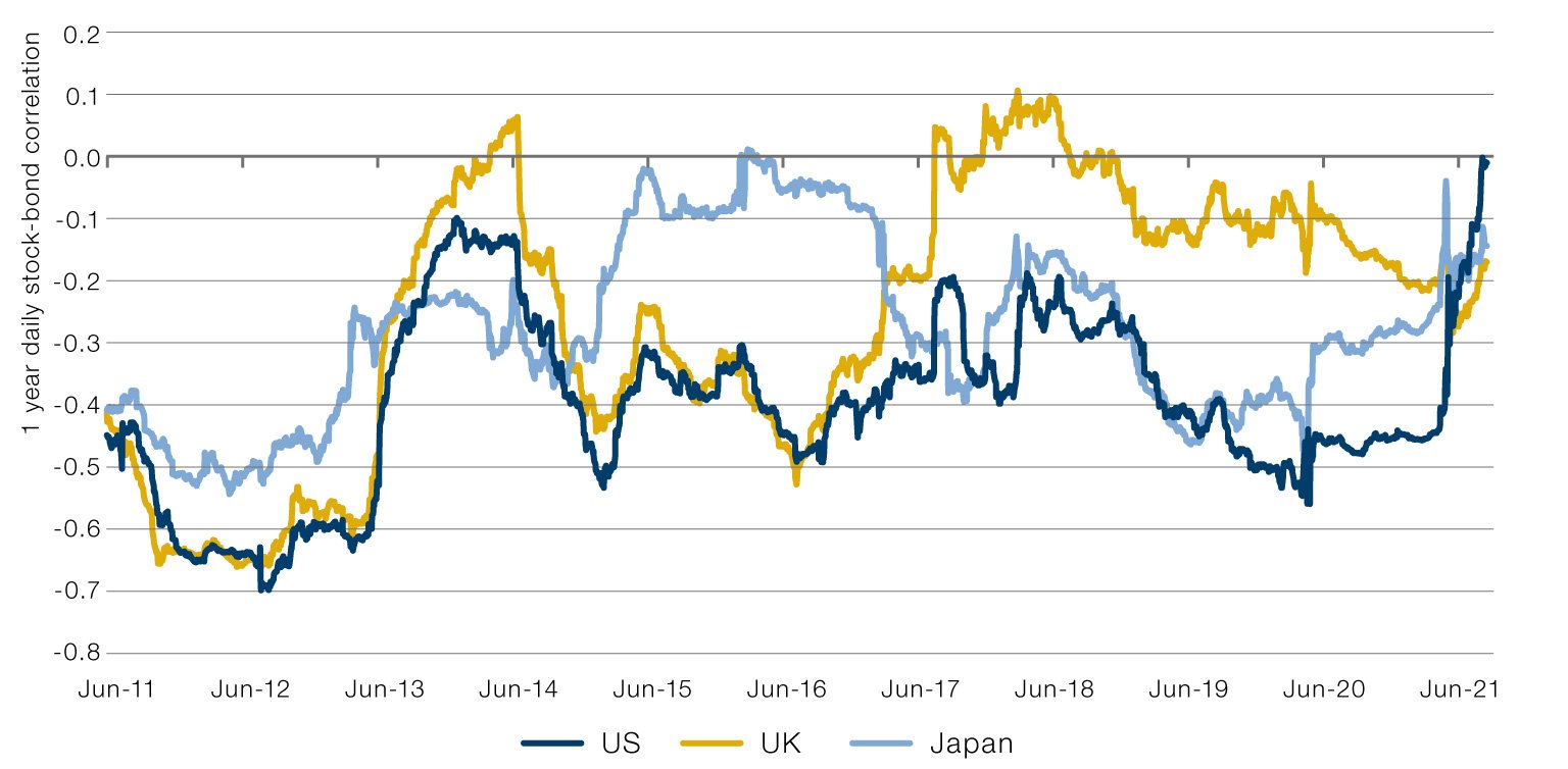
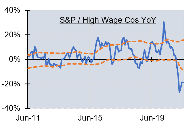
In an environment where inflation is perceived to be high and rising, it will become an overwhelming preoccupation of society, c.f. President Ford’s ill-fated 1974 public relations campaign to ‘Whip Inflation Now’. Such a backdrop is clearly bad for bonds, given the deteriorating real worth of their fixed cashflows. And while the foothills of an inflation are good for equities, as it becomes entrenched, the money illusion dissipates and wages catch up, deterioration in margins is likely.
In short, high and rising inflation has a habit of pushing itself to the front of market mind, meaning stock-bond correlations turn positive: equities and bonds both sell off when it looks like the environment will persist, and enjoy simultaneous relief rallies when the heat is turned down. Persistently high correlations are, in our view, a sign that the regime has changed.
Figure 2. Stock-Bond Correlations
2. STOCK-BOND CORRELATION

Source: Man Solutions; as of 13 July 2021.
Inflation is like a super tanker at sea; it changes direction rarely and with large turning circles. When we talk about inflation momentum, we are thinking about the components of the CPI basket which move most infrequently. When these start to go persistently in one direction, it’s likely that the tanker has turned. Here are our preferred indicators.
Figure 3. Indicators for Inflation Momentum
3. INFLATION MOMENTUM

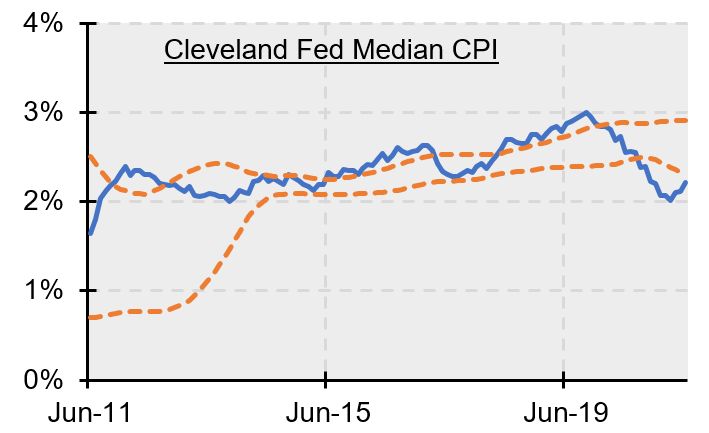
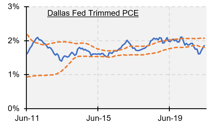
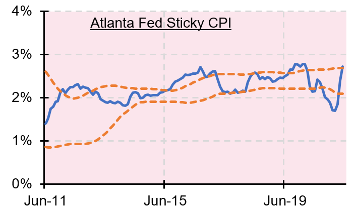
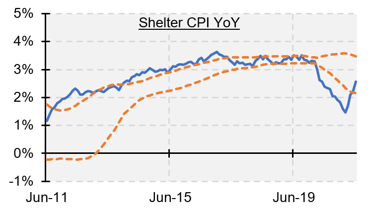
The Cleveland Fed Median CPI is the year-on-year price rise of the item that, over the trailing year, has experienced median inflation. The Dallas Fed Trimmed PCE is the same idea but, instead of taking the median, monitors the year-on-year price rise of a subset of the CPI basket, being the central 50% of the items, when ordered according to inflation over the past year. The Atlanta Fed Sticky CPI also looks at the price rises in a subset of the headline CPI index, but finds this grouping based on items that experience price moves less frequently than average. Shelter CPI YoY is important in itself because it often figures in the aforementioned momentum measures, and by implication because, as a major component of consumer spending, it represents a pinch point which, when it rises sharply, will often precipitate workers seeking wage increases, of which more later.
Source: Man Solutions; as of 13 July 2021.
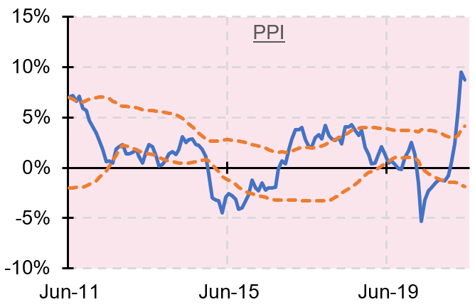
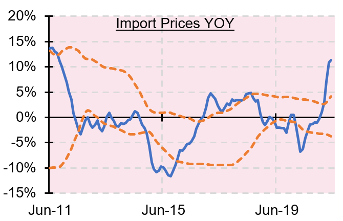
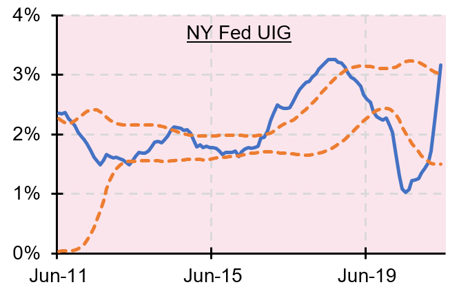
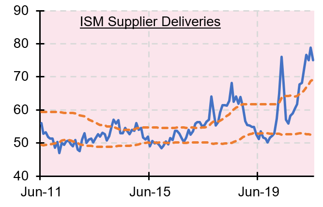
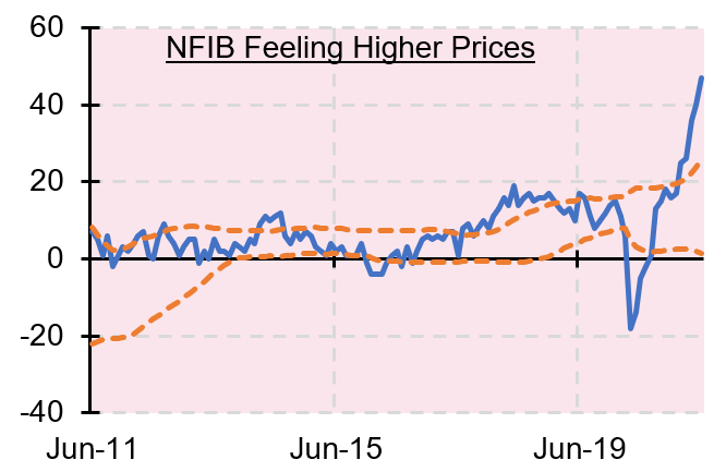
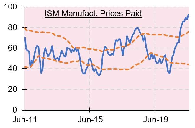
These are all metrics which impact tomorrow’s inflation. For example, lengthening supplier delivery times (i.e. the blue line in the top right chart moving higher) will not immediately impact prices for the consumer; there will be some lag while the increased scarcity value is processed by the market.
Figure 4. Inflation Pipeline Indicators
4. INFLATION PIPELINE

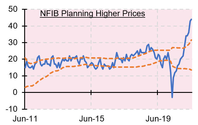
Source: Man Solutions; as of 13 July 2021.

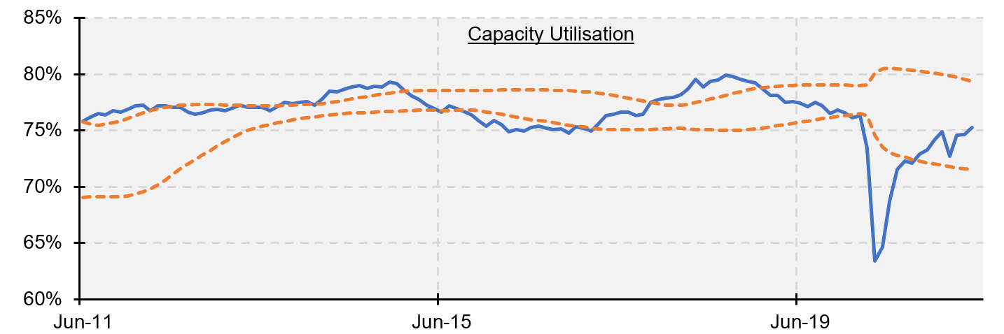
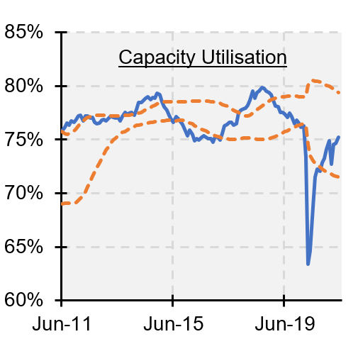
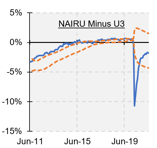
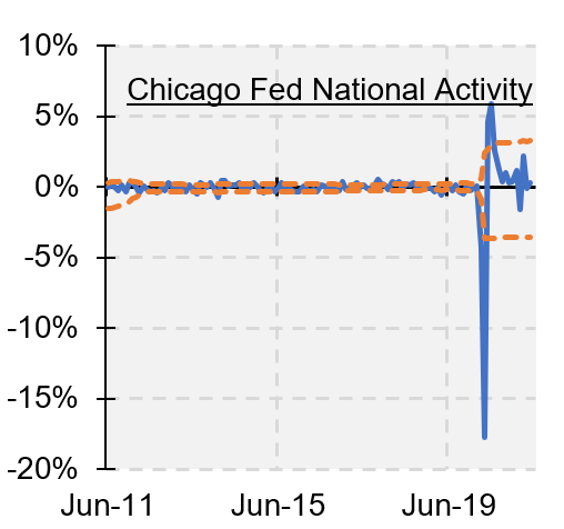
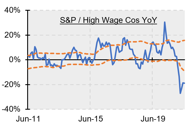
If an economy has more slack and is further within its production possibility frontier, it has the suspension to weather bumps in the supply side without pronounced price rises. Note that for capacity utilisation, we would consider anything above 80% to be indicative of inflationary pressure.
Figure 5. Indicators of Economic Slack
5. ECONOMIC SLACK


Source: Man Solutions; as of 13 July 2021.
Here we are interested in economic slack specifically applied to the labour market.
A tighter labour market should eventually feed through to higher wages which, as
we detail below, is a vital confirmatory piece in the inflationary regime change puzzle.
Figure 6. Indicators of Labour Tightness
6. LABOUR TIGHTNESS


Source: Man Solutions; as of 13 July 2021.
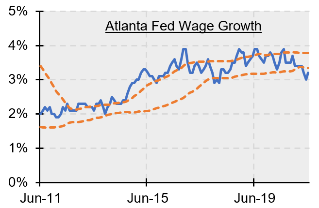
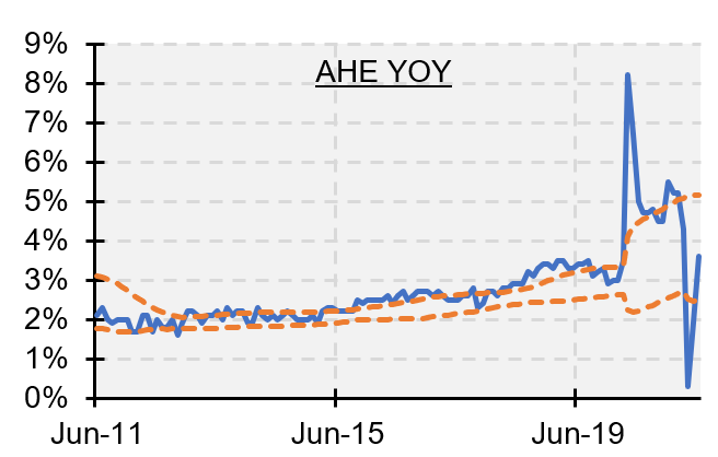
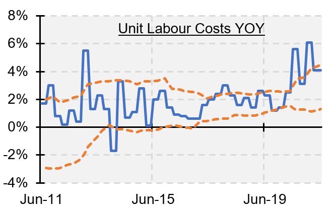
Once wages run hot for a persistent period, it is likely that inflationary regime change has become entrenched. There is a lag between price rises and consumers noticing that they are rising. Then there is a further delay between this realisation and demands for compensatory pay increases. And finally a gap between the demand and the acquiescence (or rejection).
Note the difference between the Atlanta Fed wage growth data and the official statistics for average hourly earnings from the Bureau of Labour Statistics. The former takes the growth experienced by the median wage earner in the population. It therefore irons out the mix effect which, as is seen in the recent gyrations of the latter, is particularly pronounced in the wake of recessions which, sadly, often result in disproportionate layoffs for the less well remunerated.
Figure 7. Indicators of Wage Inflation

7. WAGE INFLATION

Source: Man Solutions; as of 13 July 2021.
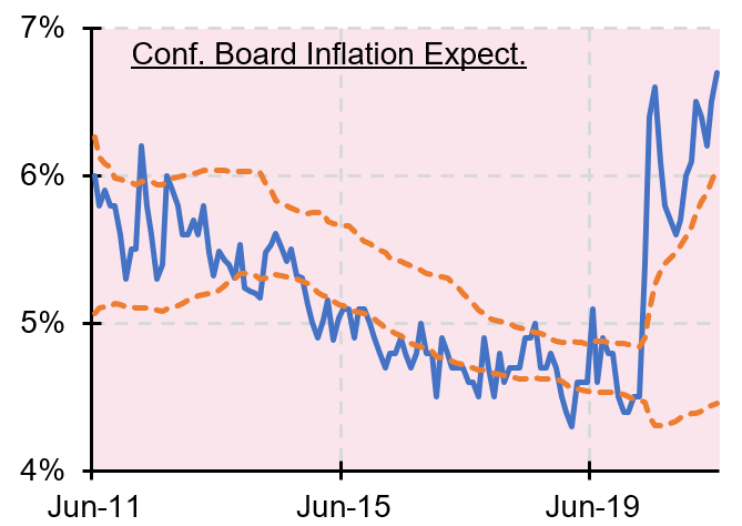
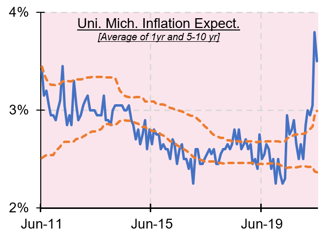
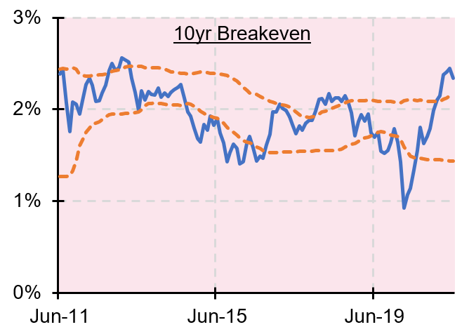
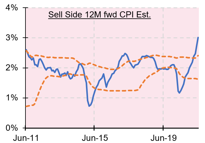
Persistently high (or low) inflation expectations can become self-fulfilling prophecies. If you are convinced that the price of that used car (to take a topical example) will be significantly dearer a year from now, you are more likely to buy it today. In other words, demand is more likely to be pulled forward which, keeping all things on the supply side equal, will lead to prices rising today.
The indicators in Figure 8 represent the expectations of the consumer (Conference Board and University of Michigan), of the buy-side (10-year breakeven) and sell-side (12-month forward CPI). The Fed increasingly look at their own ‘Common Inflation Expectations’ index. We do watch this because the FOMC clearly values it, but for our part, we are somewhat hesitant to rely on it too extensively, for a number of reasons but most importantly because the model assumes inflation expectations are mean reverting. We think this misses that expectations can be anchored for a protracted period, as they were (at a low level) for many years before Covid.
Figure 8. Inflation Expectations of the Consumer, Buy-Side and Sell-Side
8. INFLATION EXPECTATIONS




Source: Man Solutions; as of 13 July 2021.

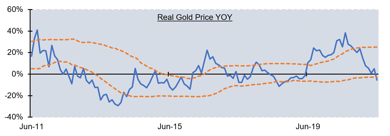
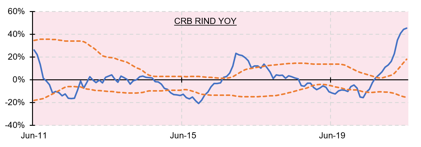
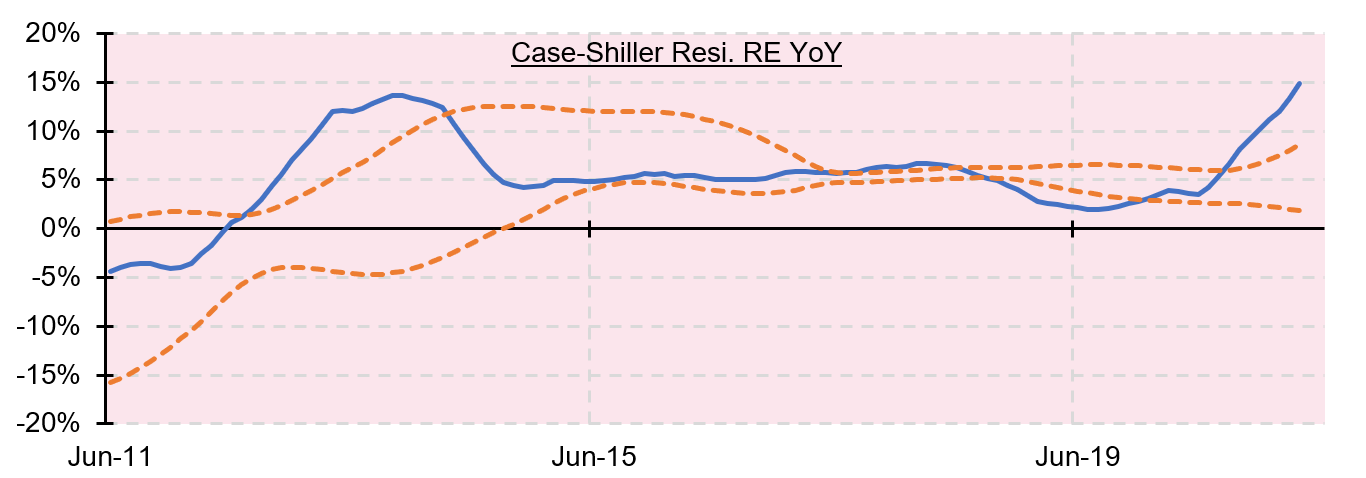
We pay particular attention to the price movements of assets that are perceived to benefit from an inflationary environment, being gold, non-tradeable commodities (the CRB RIND index contains raw materials such as tallow, wool tops and burlap) and residential real estate.
Figure 9. Gold, CRB RIND, Residential Real Estate
9. REAL ASSET PRICE ACTION


Source: Man Solutions; as of 13 July 2021.
While we don’t have space to rehearse the full argument here, the thrust of the Inflation Regime Roadmap was that simultaneous fiscal and monetary shock and awe does have the ability to jolt the economy out of its secular stagnationist torpor.
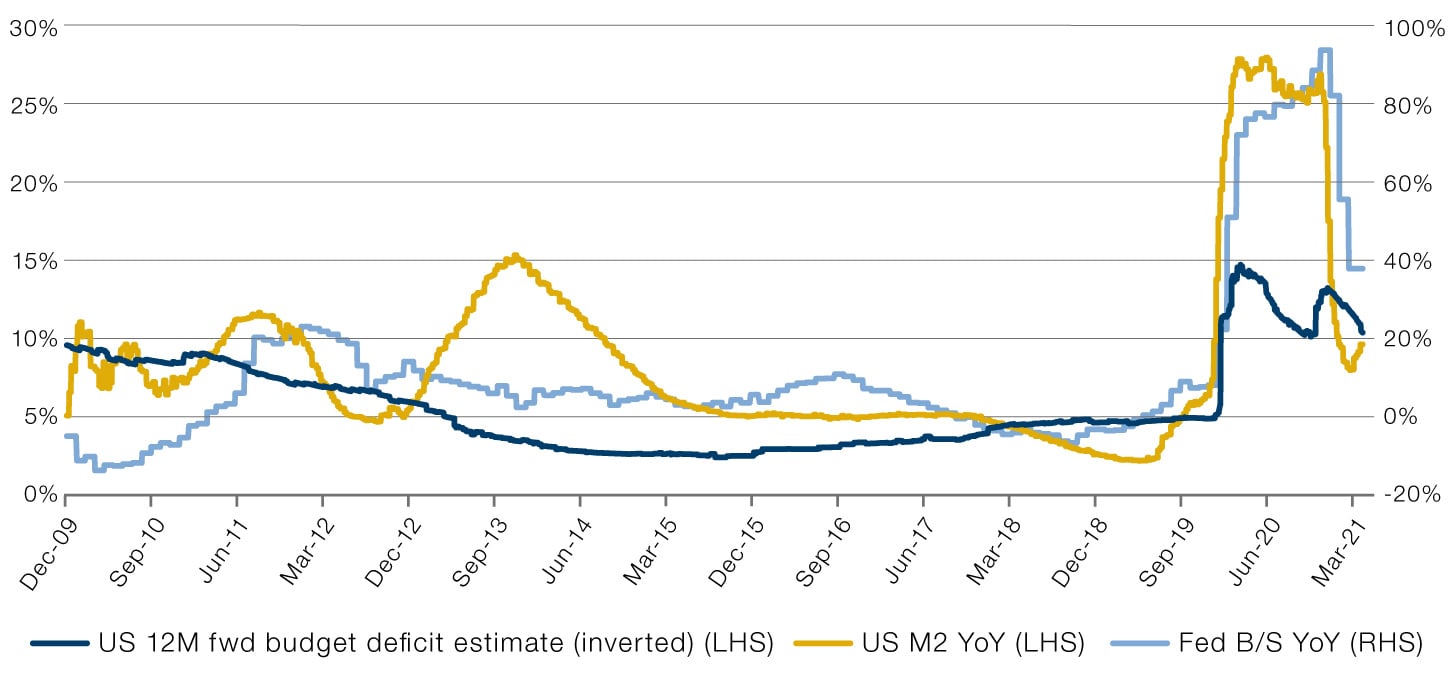
Figure 10 shows one way to track this data. The chart shows why fiscal or monetary in isolation is rarely enough to move the needle on the money supply. For instance, we see that from the end of 2012, in the wake of the Eurozone Crisis, to the end of 2013, Fed balance sheet growth went from -1% to +39% year-on-year. However this had no positive impact on the money supply growth, which fell from +7% to +5%, because the fiscal impulse was negative (the forecast deficit fell from 6% to 3% of GDP).
Covid was very different. From August 2019 to June 2020, all three pointed starkly in the same direction. Fed balance sheet growth went from -11% to +85%, the budget deficit from 5% to 14% and, consequently, growth in the money supply from 5% to 23%. Clearly there’s been some rollover since those peaks, that was inevitable. The thing to watch is how far the retreat continues.
Figure 10. Impact of Fiscal, Monetary Shocks on Money Supply
10. THE FISCAL / MONETARY FUSION


3
4
5
6
7
