Will active managers investing in emerging-market debt heed the alarms set off by the March selloff? Their actions say no…
Will active managers investing in emerging-market debt heed the alarms set off by the March selloff? Their actions say no…
June 2020

Introduction
The index exchange-traded fund (‘ETF’) is one of the biggest innovations of modern financial markets. Since its introduction in the early 1990s, the ETF market has grown to a USD4-trillion industry. The appeal of ETFs to investors is evident: not only do they offer intra-day liquidity, but they also provide beta exposure at relatively low fees.
The ETF market, at first, was primarily limited to the equities space. The main reason was that ETFs were best suited to asset classes that traded on exchanges that allowed for easier replication of the underlying indices (i.e. minimise tracking error). By contrast, fixed income markets are almost exclusively traded over-the-counter (‘OTC’), which tends to be much less liquid than exchange-traded assets. A further complication for fixed income ETFs is the number of securities: fixed income indices typically have many more instruments than their equities counterparts. For example, the S&P500 Index has 500 securities, whereas the Bloomberg Barclays US Aggregate Index has more than 11,000 securities.
Despite these challenges, fixed income ETFs – just like equity ETFs – have experienced tremendous growth, and emerging-market debt (‘EMD’) is no exception. Today, the iShares JPMorgan USD Emerging Markets Bond ETF (‘EMB ETF’), for example – which was launched in December 2007 to replicate the JPMorgan EM Hard Currency Debt index – along with its UCITS version, manage USD22 billion.1 This is bigger than the three largest active hard currency mutual funds combined.
Recorded on 25 June 2020
What You See Is Not What You Get
One of the key draws of ETFs is that they charge a lower fee, on average, than their active management peers. However, there is a ‘hidden’ fee associated with ETFs that most investors do not take into account: tracking error. Tracking error is a concept that is very familiar to anyone who has invested in actively managed benchmarked funds. It measures the volatility of the difference in returns between the fund and its benchmark; in simpler terms, it is an indicator of how much a fund deviates from its underlying benchmark.
In the case of index ETFs, one would expect a tracking error of close to zero as the purpose of an index ETF is to replicate its benchmark. Figure 1 shows the annualised difference in returns (net of fees) between select ETFs and their indices from 2018-19. Note that this is technically not the tracking error; rather, this is a more straightforward way of highlighting the ‘hidden’ cost to investors.
Figure 1. Slippage Cost of ETFs
| 2 January 2018 - 31 December 2019 | |||||
|---|---|---|---|---|---|
| ETF Ticker | Index | Annualised ETF Return | Annualised Benchmark Return | Annual Expense Ratio | Difference (Net of fees) |
| SPY | S&P500 | 11.55% | 11.69% | 9.5bp | -5.5bp |
| HYG | US High Yield | 5.69% | 6.23% | 49bp | -5bp |
| EMB | EMD Hard Currency | 4.36% | 4.95% | 39bp | -20bp |
Source: Bloomberg; as of 31 December 2019.
The slippage cost appears to be low: the SPY ETF cost is -5.5 basis points, the HYG ETF is slightly better at -5bp and even the less liquid EMB ETF is at a reasonable -20bp. However, this is merely looking at costs in normal times. A better test is to look what the slippage cost is when you need liquidity the most, i.e. during periods of deep selloffs.
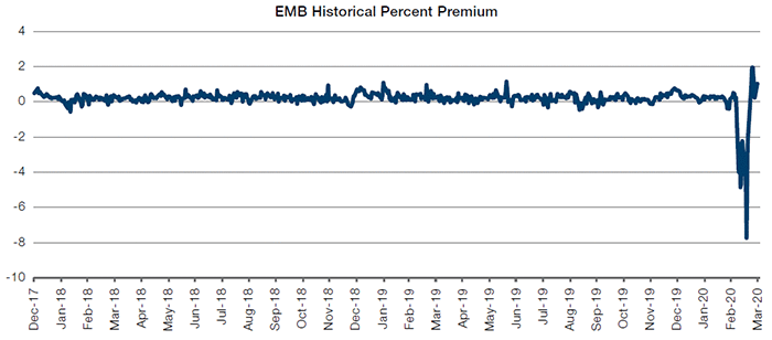
Figure 2 shows the ETF’s fund premium to net asset value (‘NAV’) during periods of selloffs. This is a measure of how much above or below the ETF trades relative to its fair value (in this case, the underlying benchmark). A positive value means the ETF is trading above fair value, which usually occurs in up markets coupled with strong inflows; conversely, a negative value means the ETF is trading below fair value, which tends to occur in down markets characterised by outflows.
When you look at the SPY ETF, nothing seems to be amiss – the slippage is minimal. Part of that is because equities did not sell off deeply during these instances. Rather, the pain was most acutely felt in fixed income markets. And there, we see a completely different picture. The HYG ETF saw average slippage of -130bp during the three episodes, while the EMB ETF was worse at -148bp.
This type of slippage is very high and a cost that most investors do not expect when investing in ETFs. Indeed, it is equivalent to almost 3-4 years’ worth of management fees!
However, that cost pales in comparison to the most recent selloff. The SPY ETF, which tracks the most liquid equity market in the world, traded at an 80bp discount to fair value. The HYG ETF traded at a 127bp discount to fair value, in line with prior sell-offs. The difference is stark, to say the least, when it comes to the EMB: it traded at a whopping 772bp discount to its fair value! Seven hundred and seventy-two basis points! Let that sink in for a second...
Figure 2. Fund Premium to NAV
| Fund Premium to NAV | |||
|---|---|---|---|
| SPY | HYG | EMB | |
| US Tapering May/June 2013 | -0.08% | -1.13% | -1.93% |
| Oil Crash Dec 2014 | -0.06% | -0.98% | -0.69% |
| US Election Nov 2016 | -0.05% | -1.78% | -1.81% |
| Corona Selloff Mar 2020 | -0.80% | -1.27% | -7.72% |
Source: Bloomberg; as of 29 May 2020.
ETFs Suck, Active Managers Rule! Right?
At this point, we bet that you – the reader – might be thinking: “I see what this is turning into, this is yet another hit piece by an active fund manager trashing ETFs and touting the superiority of active management”. Quite the contrary, in fact: if anything, what happened with ETFs during these selloffs was actually a significant negative for most active managers.
“Huh, how could that be?”, we hear you ask. Allow us to explain.
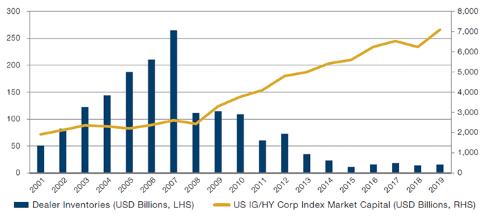
First, liquidity in all risk markets has shrunk over the years. This is illustrated in Figure 3, which shows the inventory of US corporate bond holdings held by sell-side banks (i.e. the dealers) versus the outstanding stock of tradeable US corporate debt. The inventory is much lower today than it was pre-Global Financial Crisis (‘GFC’). In contrast, the outstanding stock (which we can use as a proxy for buyside holdings) has gone up significantly post-GFC.
Figure 3. US Dealer Inventories Versus US Investment Grade/High Yield Corporate Index Market Value
Source: New York Federal Reserve, Bloomberg; as of 31 December 2019.
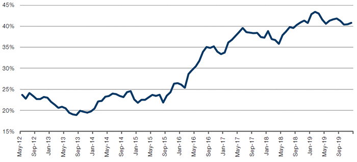
Second, ETFs have grown faster than active management. Figure 4 highlights this for the EMD hard currency space. The largest hard currency ETF has grown from 20% to almost 50% of the market as a proportion of the 10 biggest active mutual fund managers.
Figure 4. EMD Hard Currency ETF (Relative to 10 Biggest Hard Currency Mutual Funds)
Source: Bloomberg; as of 31 December 2019.
What are the implications of these two points? It means that, within the EM hard currency market, ETF players have become the proverbial big fish in a (shrinking) liquidity pond, i.e. they are the marginal buyers and sellers that largely determine market price action today.
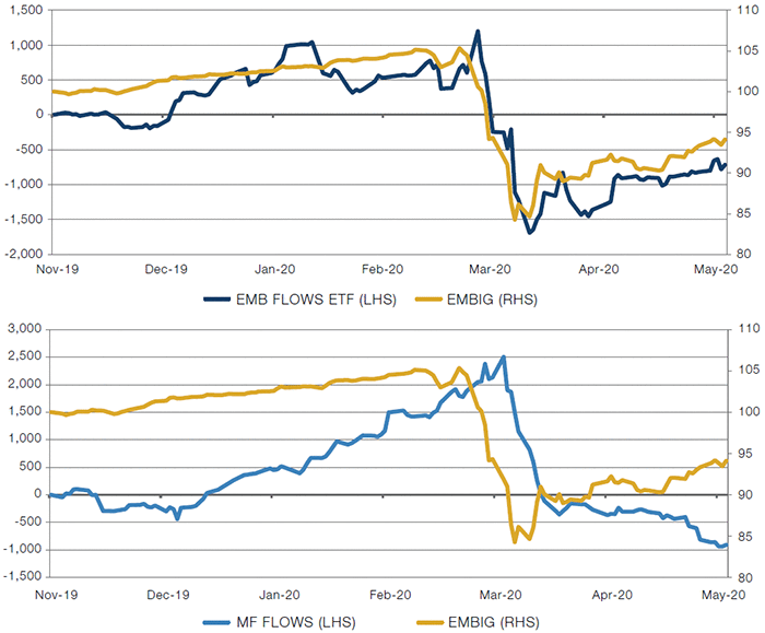
This is evident by Figure 5. The chart at the top compares the flows for the EMB ETF versus the EMBIG (an EMD hard currency benchmark) between mid-November 2019 to mid-May 2020. The two are highly correlated. By contrast, the chart at the bottom shows there is less linkage between active manager fund flows and benchmark returns. In fact, since early April, real money managers have seen net outflows even as ETF flows have ticked up and the index bounced higher.
Figure 5. EMB/Mutual Fund Flows Versus EMBIG Returns (USD Millions)
Source: Bloomberg; as of 15 May 2020.
It again begs the question: why is any of this necessarily bad for active managers?
It all has to do with positioning biases of these managers. Figure 6 highlights the one truism that these managers abide by: stay long and carry on. For the past two decades, many hard currency fund managers have almost always run betas greater than one. And for good reason: it has worked time and time again. Sure, markets sell off now and then, but they eventually bounce back; and the higher yield these managers run relative to their benchmarks give them a cushion to weather the storm.
Figure 6. Average 12-Month Rolling Beta for EM Hard Currency Managers Versus Benchmark
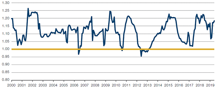
Source: Bloomberg, eVestment; as of 29 May 2020.
Note: Man GLG has selected the largest 24 daily priced Emerging Markets Debt Hard Currency funds as identified by the eVestment database Emerging Markets Fixed Income – Hard Currency universe. Only constituents with USD1 billion or more in the strategy have been included. This data being represented is not the complete universe of this asset class and investment decisions should not be made based upon this data. Mutual funds may be subject to additional fees and restrictions, therefore this data may not be representative of Man GLG’s products. The indices shown are the JP Morgan Emerging Market Bond Index Global, Emerging Market Bond Index Global Diversified, and the Emerging Market Corporate Bond Broad Diversified Index. The Blend is comprised of 50% JPM EMBIG and 50% GBI EM Global Div Indices. The ‘implied beta’ is the beta of the average of the above funds versus that of the blended index.
This strategy of running higher yield only works when default rates are close to zero, which had been the case for the past two decades. However, we believe we are now entering a different regime where default rates will spike. (Read ‘Go Hard or Go Home’ for more.)
But the purpose of this paper is not to focus on our views of defaults; rather, it is to show how this strategy of running persistently higher beta than the benchmark is now vulnerable because of the ascent of ETFs. In order to run higher yield (and in turn higher beta) than the benchmark, it requires fund managers to run overweights in the riskiest segments of the universe. In the case of EMD hard currency, this is frontier markets and off-benchmark high-yield corporates. And because these are long-only managers with limited ability to run leverage, they often run underweights in the higher-quality low-yielding countries to make room for these overweights.
Figure 7 shows to what extent these managers run such overweights. The table shows the output from running a multi-variate regression of the 6-week daily returns of active fund managers against the variables shown: bellwethers (high-quality low yield countries), frontier markets, high-yield corporates, UST 10-year, emerging market (‘EM’) FX and Venezuela.
Figure 7. Six-Week Return Regression of EMD Hard Currency Funds
| Average Coefficient | ||||||
|---|---|---|---|---|---|---|
| 13-May | 15-Apr | 01-Apr | 18-Mar | 11-Mar | 19-Feb | |
| Relative to Benchmark | ||||||
| Bellwether | -0.135 | -0.255 | -0.249 | -0.304 | -0.216 | -0.11 |
| Frontier markets | 0.105 | 0.049 | 0.04 | 0.102 | 0.124 | 0.119 |
| HY Corporate | 0.142 | 0.199 | 0.197 | 0.204 | 0.145 | 0.111 |
| US Treasuries 10-year | 0.106 | 0.105 | 0.092 | 0.071 | 0.073 | -0.009 |
| High-carry FX | 0.027 | 0.08 | 0.075 | 0.087 | 0.049 | 0.028 |
| Venezuela | 0.006 | 0.005 | 0.004 | 0.003 | 0.007 | 0.004 |
Source: Man GLG, eVestment; as of 13 May 2020.
The coefficients shown are relative to the benchmark. EMD hard currency fund managers were running sizeable overweights in frontier markets and high yield corporates heading into the selloff. These two segments also happen to be the most illiquid securities in EMD.
Why is that important?
Well, when ETFs started getting hit with outflows in March, by rule, they had to sell all the underlying securities in their benchmark. That included frontier market bonds, which make up more than 20% of the EMB ETF holdings. And these ETFs sold those bonds at below-market prices (i.e. prices below where they were marked by the dealer banks), which is what caused the ETFs to sell at such a large discount to fair value.
That caused the active fund managers to realise large mark-to-market losses in their funds given their outsized holdings in frontier markets. This, in turn, led to investors redeeming from these funds, which then led to these funds attempting to liquidate their frontier market and high yield corporate bonds, i.e. their overweights. There wasn’t enough liquidity, which led to prices of these securities to precipitously spiral downward.
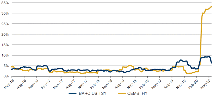
Figure 8 captures this phenomenon exactly. The yellow line is the realised rolling 3-month volatility of the EMD High Yield Corporate Index and the blue line is the rolling volatility of the Barclays US Treasury Total Return Index. Note that high yield corporates are quoted off US Treasuries.
Notice something odd? And no, we’re not talking about the big spike in volatility during the recent selloff.
Rather, look at the time period preceding that. High yield corporates traded with less volatility than the risk-free asset for essentially the prior four years! This was because the illiquidity of the high yield space fed the illusion of low volatility as no one needed to sell these bonds during this time period. When fund managers were finally forced to sell their positions, volatility spiked higher quickly and severely.
When investors saw the low volatility, they had to come to one of two conclusions: Either this is the best risk-adjusted trade in the world which one should continue to stay long (and dealers will start quoting US Treasuries as a spread over EMD high yield bonds) …or you stay the hell away from this trade as this is going to end very, very badly. And we know how it turned out.
Figure 8. Three-Month Rolling Volatility of EM High Yield Corporates Versus US Treasuries
Source: JPMorgan, Bloomberg; as of 29 May 2020.
Barbarians at the Gate
Does this mean that active managers should no longer invest in the less liquid segments of the asset class? No, it does not. There will be moments when fundamentals and valuations become attractive enough that it offsets the liquidity premium needed to invest in these securities.
Rather, the lesson here for the active management community is that we no longer operate in an environment where one can be persistently long beta through holding such assets. The ascent of ETFs, combined with the ever-shrinking balance sheet of dealers, means that deep selloffs like the one we experienced may happen with higher frequency than in the past.
Most fund managers operate daily liquidity vehicles, which means that fund managers should be mindful of the liquidity risk they run in their portfolios. Indeed, there have already been warning signs of what happens when one is caught wrong-footed with illiquid assets. If these episodes can happen in calm markets, one can only imagine what could have happened this time around when systemic risk reared its ugly head.
Will managers heed the alarms set off by the March selloff? Their actions say no – rather than reducing the most illiquid holdings of their funds, most asset managers increased their holdings of such securities after the selloff in the expectation that the Federal Reserve will light a spark to another rally.
And maybe they’re right... maybe the Fed will always be there to bail everyone out. Or maybe, next time they can’t or won’t – and asset managers will have no choice but to bring the gates down on their funds as no other alternative appears.
1. Source: Bloomberg; as of 17 June 2020.
You are now exiting our website
Please be aware that you are now exiting the Man Institute | Man Group website. Links to our social media pages are provided only as a reference and courtesy to our users. Man Institute | Man Group has no control over such pages, does not recommend or endorse any opinions or non-Man Institute | Man Group related information or content of such sites and makes no warranties as to their content. Man Institute | Man Group assumes no liability for non Man Institute | Man Group related information contained in social media pages. Please note that the social media sites may have different terms of use, privacy and/or security policy from Man Institute | Man Group.