Just like in the late 1990s (following the US tightening of 1994), we believe EMD will get stressed over the coming years.
Just like in the late 1990s (following the US tightening of 1994), we believe EMD will get stressed over the coming years.
May 2019
Introduction
We have maintained a cautious view toward emerging market debt (‘EMD’) for quite some time now, predicated on three main factors.
First, we believe inflows into asset classes that have been substitutes for high-quality government bonds will decrease as the net supply of high-quality government bonds increase, and as there is potential for tighter monetary policy outcomes than what the US curve is currently pricing in.
Second, it is our view that the reduction in marginal inflows into substitute assets, of which EM fixed income is just a part, will require the current accounts of EM countries to strengthen to compensate for the decrease in capital inflows. This, in turn, is likely to require weaker exchange rates going forward.
Third, we feel hard currency valuations do not compensate for the risk involved in them. As the two points indicated above materialise, we believe default rates will increase from almost zero (where they have languished for the last 18 years) to historical averages, and spreads will widen.
Indeed, we expect the next three to five years to be much more difficult for the assets that have been traditionally purchased as substitute for high-quality government bonds during the years of quantitative easing (‘QE’). In the specific case of EM, we believe the environment will be reminiscent of the second half of the 1990s, when – on the back of the 1994 tightening in US monetary policy – the asset class experienced stress until the early 2000s. In such an environment, we believe that to be successful, investors will need a much more differentiated approach to risk-taking than the mere decision to go long / neutral EM beta, which has been typical between the mid-2000s and now.
It is necessary to point out that this note was written on 3 May, just before President Donald Trump’s tweets about the souring of the trade negotiations with China. Hence, if over the next few days the situation resolves itself, everything discussed below will, in our view, be fully applicable. Alternatively, the initial discussion on how the cuts priced by the US curve over the next year would need to be replaced by a discussion on how much such cuts would compensate for the economic damage derived from the escalation of tariffs.
Marginal Flows into ‘Substitute’ Asset Classes to Decrease Structurally
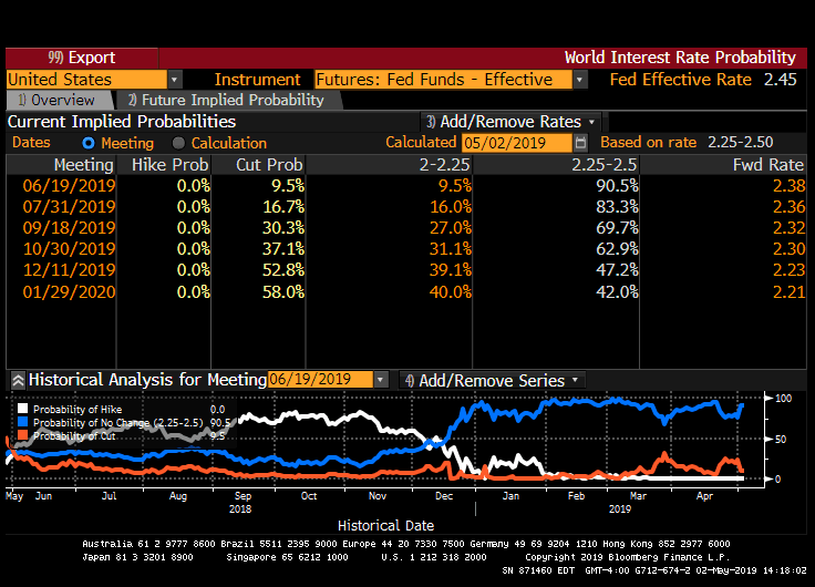
We believe that the increase in the net supply of high-quality government bonds, coupled with a tighter monetary stance than what the market is currently pricing in, are likely to crowd out part of the demand for substitute assets. With regards to the latter, market participants are pricing in a combined 58% probability that the Federal Reserve will cut rates by the first Federal Open Market Committee (‘FOMC’) meeting on 29 January, 2020 (Figure 1).
Figure 1. Current Implied Probabilities for the Future Distribution of Fed Fund Rates
Source: Bloomberg; as of 6 May 2019.
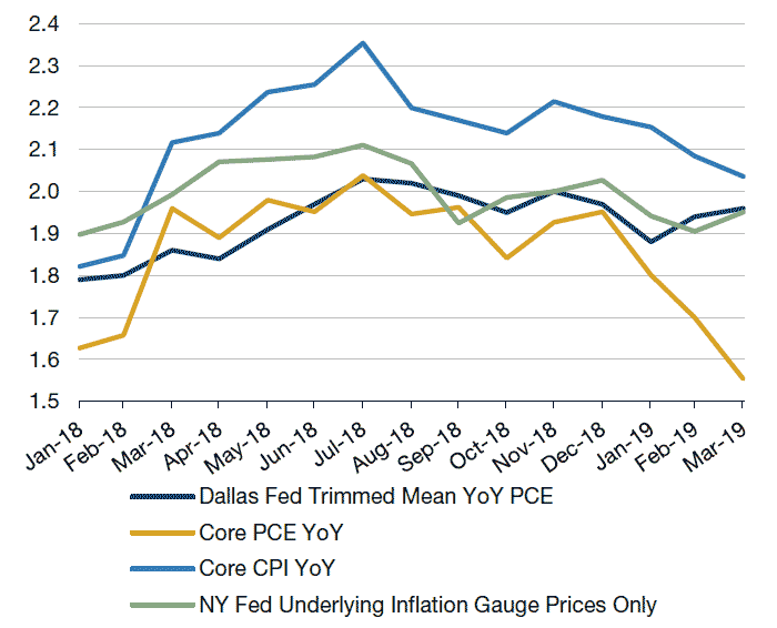
One of the more popular arguments floated in the two weeks prior to the 1 May, 2019 FOMC meeting was that the drop in core inflation and core personal consumption expenditure (‘PCE’) since July 2018 would justify at least an ‘insurance’ cut to prevent inflation expectations to drift structurally lower (Figure 2).
Figure 2. Measures of Core Inflation
Source: Bloomberg; as of 6 May 2019.
Nevertheless, when we look at alternative measures of core inflation (backward-looking ones, such as core CPI and core PCE), it would appear that the significant drop in core PCE is somewhat exaggerated. There is consensus among US economists that a significant part of the weakness in 2019 core PCE is a consequence of a methodological change in the way the Bureau of Labor Statistics collects some of the data. Indeed, this explains the disinflation experienced by used cars, jewelry and clothing, which – according to State Street Bank – accounts for half of the fall in core PCE in 2019.
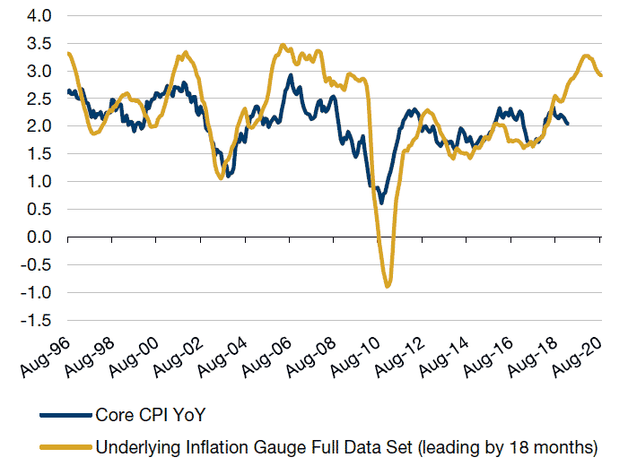
Finally, when we look at a measure of core inflation – such as the NY Fed underlying inflation gauge full data set (‘UIGF’), which incorporates high frequency data, and financial condition variables in the indicator, thus making it forward-looking – we see that core inflation would appear to be likely to accelerate (Figure 3).
Figure 3. Core Inflation Likely to Accelerate
Source: Bloomberg; as of 1 May, 2019.
Figure 3 shows that UIGF has led core inflation by about 1.5 years, which is roughly consistent with the lags of US monetary policy.1 To this point, the drop in core inflation in February and March 2019 had been anticipated by UIG, after which the index resumed an upward trend. This is also concurrent with the last batch of price index releases in the US, suggesting that inflation is picking up.2
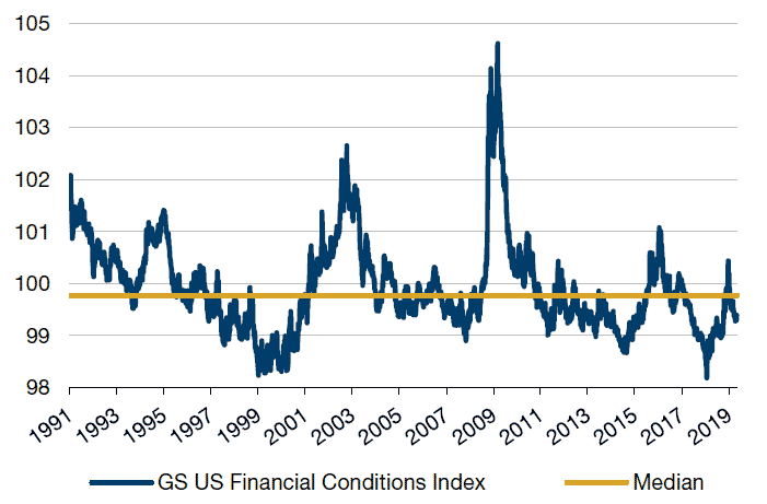
The tightening of financial conditions in 2018 (and its acceleration in the second half in particular, Figure 4), was at the core of the Fed’s decision to pivot from a hawkish to dovish stance. However, since the second fortnight of December, financial conditions have loosened and currently are at a level more expansionary than the median for the last 30-year period.
If the US economy continues to recover and core inflation was to accelerate (as the UIG and looser financial conditions seems to corroborate), we believe the Fed could go in one of two ways. First, the Fed will have to increase rates, impacting the short-end of the yield curve. Secondly, if it decides to run a more expansionary monetary policy, this will push the long end of the curve higher as the market recognises a higher future inflation trend.
The Fed’s ongoing discussions about shifting to a concept of “average inflation targeting over the cycle” are directed to pushing inflation expectations back up. This could trigger a normalisation in term premia, currently depressed by the risk of hitting back the zero bound for interest rates. The impact could be even higher as the market would have to anticipate the Fed’s need to overtighten down the road as it falls behind the curve.
In light of the average duration of the EM external and local debt indices (currently at 7.0 and 5.1 years, respectively), such a change in the long end of the US yield curve may be quite a headwind for EMD valuations and returns.3
Figure 4. GS Financial Condition Index
Source: Bloomberg; as of 28 February, 2019. * Higher is consistent with tighter financial conditions and vice versa
Treasury Supply and the Crowding out of Risk Assets
Another two drivers of the potential slowdown in capital inflows into EM will be the increase in US Treasury bond supply and the end of QE in Europe.
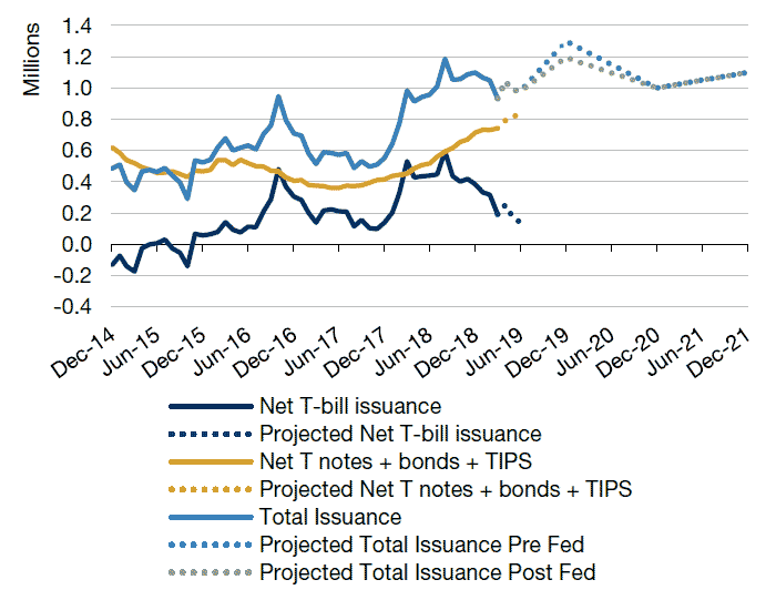
The annual new issuance of US Treasuries accelerated in 2018 – to a peak of USD1.2 trillion from roughly USD500 billion at the end of 2017 – due to the increased deficits incurred by the US government as a consequence of tax reform. We believe such fiscal deficits will likely continue going forward and keep the net new supply of debt running between USD1 trillion to USD1.2 trillion.
The change in net new supply of Treasury debt – from USD500 billion annually until 2017 to roughly USD1.1 trillion from 2018 on – entails a roughly USD600 billion increase in annual US Treasury bonds supply that will accumulate annually over the years. In other words, this increase in US debt issuance is larger than all of the hard currency debt issued by EM sovereign and corporates, 36% of all of the net new issuance of private sector debt in the US in 2018, and more than two times than the increase in stock buybacks that took place in 2018 in the US (on the back of tax reform).
Figure 5 shows our projection of net Treasury issuance before, and after, the Fed’s announcement on the balance sheet. In our view, this change is negligible and does not justify the market’s euphoria in the aftermath of the March’s FOMC meeting.
Figure 5. 1-Year Rolling Net US Treasury Issuance
Source: Haver,U.S. Department of Treasury, Man GLG; as of March 21, 2019. Please note projected issuance is provided by Man GLG’s emerging markets debt team. These projections should not be relied upon and are subject to change. There can be no assurance that these projections are now or will prove to be accurate.
The projections for net US Treasuries issuance are derived from using the Treasury dealer’s budget deficit expectations, and a terminal point of the balance sheet contraction of USD3.8 trillion (as depicted by the green dashed line on Figure 5). The light blue dashed line shows our prior projection, which worked with the prior market consensus among Treasury dealers that estimated a balance sheet of USD3.5 trillion by 2025. This entailed a contraction to USD3 trillion by mid-2020 at the peak pace of quantitative tightening, and growth at the nominal growth rate for GDP, reaching USD3.5 trillion in 2025.
An additional headwind to the increase in the annual US Treasury issuance is constituted by the end of QE in Europe, where the European Central Bank has been buying EUR360 billion worth of government bonds on an annualised basis (equivalent approximately to USD400 billion) until the end of 2018. Thus, the net supply of high-quality government bonds that the private market will have to absorb from 2019 onwards will be USD1 trillion bigger than what it was used to up until late 2017. Clearly, there will be asset classes that will find their demand crowded out; a likely problem for issuers that got addicted to easy funding over the years of QE.
Figure 6. Rolling 1-Year Change of Fed+ECB+BOJ Balance Sheet (USD)
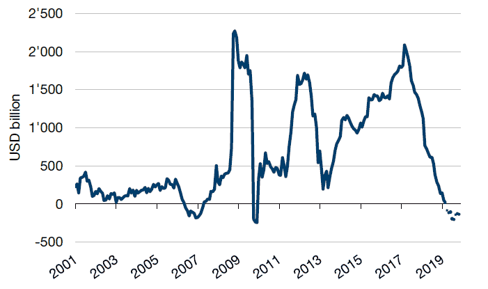
Source: Bloomberg; JP Morgan; as of 5 April, 2019; Please note projections provided by Man GLG’s emerging markets debt team should not be relied upon and are subject to change. There can be no assurance that these projections are now or will prove to be accurate. Projections for the remainder of 2019 assume that the Fed slows balance sheet reduction in May and ceases it after September, ECB maintains the size of its balance sheet and BOJ continues to inject liquidity at the same pace observed in 2018H2.
Finally, it is worth pointing out that the balance sheet dynamics of the central banks, which – as we mentioned earlier – are now a headwind. The dynamics closely determine the direction and the magnitude of flows into EM bond funds (Figure 7). Keep this in mind as a counter to the traditional argument made by EM managers – that developed-market investors are generally underweight EM and, as a consequence, in the current ‘benign’ environment, the tsunami of capital inflows seen during the times of QE should continue.
Figure 7. Change in Size of Balance Sheets for Fed, ECB and BOJ Versus Flows Into Sample of EM Mutual Bond Funds
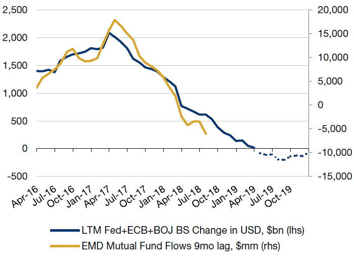
Source: Bloomberg, JP Morgan; as of 30 April, 2019. The above is represented by the largest mutual fund managers within the eVestment Emerging Markets Fixed Income – Local Currency and Hard Currency universe that report daily returns and AUM via Bloomberg.
We Believe EM Consensus is Wrong on Both Fundamentals and Currency Valuation
The consensus among EM investors is that the improvement in EM current accounts from 2013 to 2018, coupled with relatively cheap real exchange rate valuations, justify having significant exposure. As we have mentioned before, we believe this consensus is wrong.
It is true that the weighted average current-account balance as a share of GDP for countries comprising the EM local bond index (Figure 7) was close to equilibrium up to early 2018. However, the fact that for the last two years, current accounts ceased to improve (in spite of fairly cheap valuations) and started to display signs of deterioration in the second half of 2018, is a very negative sign.
While EM terms of trade have been falling since 2011, our view is that the majority of EM governments have kept spending as a share of the GDP close to the peak levels reached in the late 2000s. These countries funded their larger fiscal gaps by increasing debt and tax rates, which, in turn, contributed to crowding out private-sector investment.
Between 2013 and early 2016, as EM currencies depreciated, the real purchasing power of consumers declined, imports contracted and EM current accounts improved. However, the lack of investment meant that when consumption recovered from early 2017, there was not enough capacity available to meet the increase in demand and capacity and competitiveness to grow exports. Thus, by mid-2017, as these economies began to reaccelerate, imports recovered, EM current accounts stalled and later deteriorated to a deficit of -0.5% of GDP (as of the fourth quarter of 2018, Figure 8). In spite of EM currency valuations being close to the cheapest levels versus the US in real terms for the last 18 years, the current account balances could not reach the highs seen in the 2000s, something that, in our view, supports our thesis.
Figure 8. JPM GBIEMGD Bilateral Real FX Versus USD and Current Account Balance/GDP
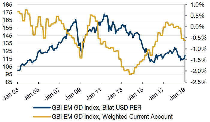
Source: Bloomberg and Man GLG database; as of 28 February, 2019.
The poor behaviour of the external accounts of EM countries, coupled with the potential for surprises in the evolution of rates in the short end of the US curve and the increase in the net supply of high-quality government bonds discussed above, will require EM countries to bring their current-account balances into stronger positions (i.e. surpluses). At the current juncture, this seems to be only possible via further real exchange rate depreciation. This is why – contrary to market consensus – we believe that investors who pile into EM local currency exposure without being extremely selective do so at their peril.
Evaluating the Risk-reward for EM External Debt
When we regress historical series of hard currency debt returns with different possible drivers for such returns, we find that the two main drivers (with statistical significance) are EM FX performance and the performance of US high yield. The intuition behind this is that EM FX is probably the most liquid indicator of fundamentals for the EM countries, while high yield matters as crossover investors would leak into EM to improve credit diversification.
So far in 2019, we believe high-yield performance has been more impactful than usual. This explains the divergence that we have seen between EM external debt and currencies year to date. A positive income that investors in DM credit have been desperate to find, coupled with rally in high yield since October 2018, has, to some extent, supported the performance of EM hard currency.
Figure 9 shows where credit spreads are for a number of EM countries that compose 90% of the EMBI Global Index; the low and high for such spreads since the end of 2010 (following the normalisation after the global financial crisis; and the number of years of carry that would be needed for an investor to recover the losses if spreads moved to the highs that we have seen in each country in the last eight years (assuming that the risk is taken in 5-year CDS or bonds).
Figure 9. EM Credit Spreads
| Country | Weight | Cumulative MBIG Weight |
Duration | Current | 12 December 2010 to Now | Years of Carry to Compensate Move to Highs |
|
|---|---|---|---|---|---|---|---|
| 5-yr Z-spread | Lowest | Highest | |||||
| Mexico | 11.2% | 11.2% | 8.4 | 111 | 63 | 233 | 9.3 |
| Indonesia | 8.8% | 20.0% | 8.1 | 96 | 76 | 330 | 14.8 |
| China | 8.3% | 28.3% | 4.8 | 41 | 39 | 202 | 19.8 |
| Turkey | 6.0% | 34.3% | 6.3 | 439 | 110 | 588 | 6.5 |
| Russian Federation | 4.5% | 38.9% | 7.6 | 128 | 102 | 632 | 23.7 |
| Brazil | 3.9% | 42.7% | 7.2 | 169 | 99 | 543 | 18.1 |
| Argentina | 3.4% | 46.1% | 5.7 | 964 | 347 | 1336 | 5.1 |
| Philippines | 3.0% | 49.2% | 8.7 | 50 | 50 | 277 | 21.8 |
| Colombia | 2.8% | 52.0% | 9.5 | 100 | 74 | 333 | 15.1 |
| Saudi Arabia | 2.5% | 54.5% | 9.4 | 80 | 41 | 209 | 15.1 |
| South Africa | 2.3% | 56.7% | 6.7 | 188 | 100 | 400 | 10.2 |
| Chile | 2.2% | 58.9% | 9.5 | 39 | 35 | 167 | 17.6 |
| Oman | 2.1% | 61.0% | 6.5 | 310 | 184 | 355 | 1.2 |
| Kazakhstan | 1.8% | 62.8% | 9.0 | 71 | 67 | 355 | 20.3 |
| Egypt | 1.8% | 64.6% | 6.8 | 315 | 247 | 923 | 11.8 |
| Qatar | 1.7% | 66.3% | 10.5 | 64 | 44 | 150 | 9.4 |
| Ukraine | 1.7% | 68.1% | 4.5 | 627 | 371 | 4300 | 47.5 |
| Venezuela | 1.7% | 69.7% | 1.4 | NA | NA | NA | |
| Ecuador | 1.7% | 71.4% | 4.7 | 362 | 245 | 541 | 3.5 |
| Panama | 1.6% | 73.1% | 9.8 | 62 | 55 | 240 | 15.5 |
| Peru | 1.6% | 74.7% | 9.8 | 58 | 52 | 233 | 16.2 |
| Uruguay | 1.5% | 76.2% | 11.4 | 93 | 82 | 248 | 9.1 |
| Dominican Republic | 1.4% | 77.6% | 7.5 | 307 | 250 | 607 | 5.8 |
| Lebanon | 1.4% | 79.0% | 5.0 | 800 | 302 | 943 | 2.3 |
| Sri Lanka | 1.3% | 80.3% | 4.5 | 442 | 243 | 691 | 4.9 |
| Malaysia | 1.3% | 81.6% | 6.5 | 56 | 50 | 241 | 17.8 |
| Hungary | 1.2% | 82.9% | 4.6 | 82 | 80 | 735 | 39.2 |
| Nigeria | 1.2% | 84.0% | 7.6 | 471 | 216 | 753 | 6.3 |
| Poland | 1.2% | 85.2% | 3.6 | 66 | 44 | 336 | 29.5 |
| United Arab Emirates | 1.1% | 86.3% | 8.4 | 59 | 35 | 150 | 12.5 |
| Romania | 0.8% | 87.0% | 6.9 | 170 | 100 | 542 | 17.9 |
| Croatia | 0.7% | 87.8% | 2.8 | 89 | 84 | 576 | 27.8 |
| Bahrain | 0.7% | 88.5% | 6.2 | NA | NA | NA | |
| Ghana | 0.7% | 89.2% | 6.9 | 557 | 303 | 1434 | 13.9 |
| Azerbaijan | 0.7% | 89.9% | 5.9 | 203 | 181 | 642 | 11.6 |
|
Average number of years of carry required to recover from widening |
14.8 | ||||||
Source: Bloomberg and Man GLG database.
We understand that for the typical European investor, ’just’ 14.8 years of carry to breakeven might look juicy for investors that have got used to negative yields at home. Indeed, there are a lot of different objections that can be raised to this analysis; the main one being our assumption that all countries go to their post-2010 wides. In this sense, the correlations, when the asset class sells off, are so high that even if we are not exactly correct numerically, we believe portfolio diversification will not work to prevent most of these assets from selling off to close to historical highs or beyond.
Conclusion: 1990s Déjà Vu
We have explained the crowding out process that may be a headwind for substitute assets in the years to come (EM being one of them); the need for weaker real exchange rates among EM countries to compensate; and the very extended levels of credit valuations. There are additional factors that we believe will challenge the asset class, such as more services-driven Chinese growth (i.e. not supportive of commodity prices), or the significant accumulation of positioning reaching for carry. We believe that these last factors will be secondary to the three main points discussed in this note. The next few years are likely to be reminiscent of the second half of the 1990s, or the 1980s in our view . Both were periods in which EM countries came from periods of easy financing and attractive terms of trade and faced headwinds derived from tighter US monetary policy. Even if nominal rates in the US are still relatively low, real rates have been increasing steadily now since late 2014. Just like we experienced in the late 1990s (following the US tightening of 1994), we believe that the asset class as a whole will get stressed over the coming years.
1. Underlying Inflation Gauge (UIG) is a measure of trend inflation introduced by the New York FED in September 2017 to complement the previous current standard measures. The UIG data goes back to 1995. To calculate trend inflation (behaviour of inflation over longer time periods), transitory changes in inflation are be removed such as volatile components or specific items. The UIG derives trend inflation from a large set of data that extends beyond price variables and it has shown higher forecast accuracy than traditional core inflation measures. Core CPI is the most widely used and accepted form of estimating trend inflation, only focuses on price components.
2. March Core inflation index, released on April 10, was 0.1% below expectation, mainly as a result of a methodology change for data collection that depressed the number in that release. However, on April 12, both the headline and core US Producer Price (PPI) Indexes for March came in at 0.3% and 0.1% above the market estimate, respectively, with the headline number logging the largest monthly increment in five months that if annualised would bring wholesale inflation to above 5%.(annualised). The release of the import inflation and export inflation for March came shortly after, showing a reading in both cases above market expectations. twice as high as it had been expected. Import prices climbed 0.6% in March, above the 0.4% expected by the market, and after jumping an upwardly revised 1.0% in February. Export prices increased by 0.7% in March, above the 0.2% expected by the market, matching the upwardly revised registered in February.
3. As measured by J.P. Morgan EMBI Global Composite, for EM external debt sector, and J.P. Morgan GBI-EM Global Diversified Composite Unhedged USD for EM local sector, as of April 29, 2019.
You are now exiting our website
Please be aware that you are now exiting the Man Institute | Man Group website. Links to our social media pages are provided only as a reference and courtesy to our users. Man Institute | Man Group has no control over such pages, does not recommend or endorse any opinions or non-Man Institute | Man Group related information or content of such sites and makes no warranties as to their content. Man Institute | Man Group assumes no liability for non Man Institute | Man Group related information contained in social media pages. Please note that the social media sites may have different terms of use, privacy and/or security policy from Man Institute | Man Group.